Background
Most product education is treated as an afterthought: a collection of help articles, tutorials, and feature pages that users have to seek out on their own. As the Content Design lead for user education on Meta's smart glasses, I saw an opportunity to rethink that model.
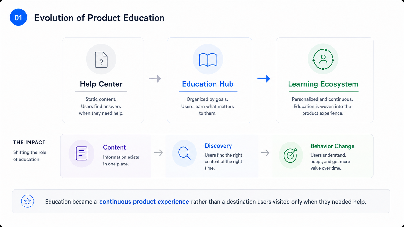
Rather than redesigning a single education screen, I redesigned the learning ecosystem for the Meta View app. The result was a scalable framework that brought together fragmented educational experiences into a single destination, helping people discover, understand, and continue exploring their glasses throughout ownership. The work later informed the education experience in the Meta AI app.
The challenge
As Meta's smart glasses evolved, so did the complexity of teaching people how to use them.
Educational content lived across multiple surfaces, feature discovery was inconsistent, and users often didn't know where to go to learn something new. At the same time, new capabilities were launching regularly, making the experience increasingly difficult to navigate.
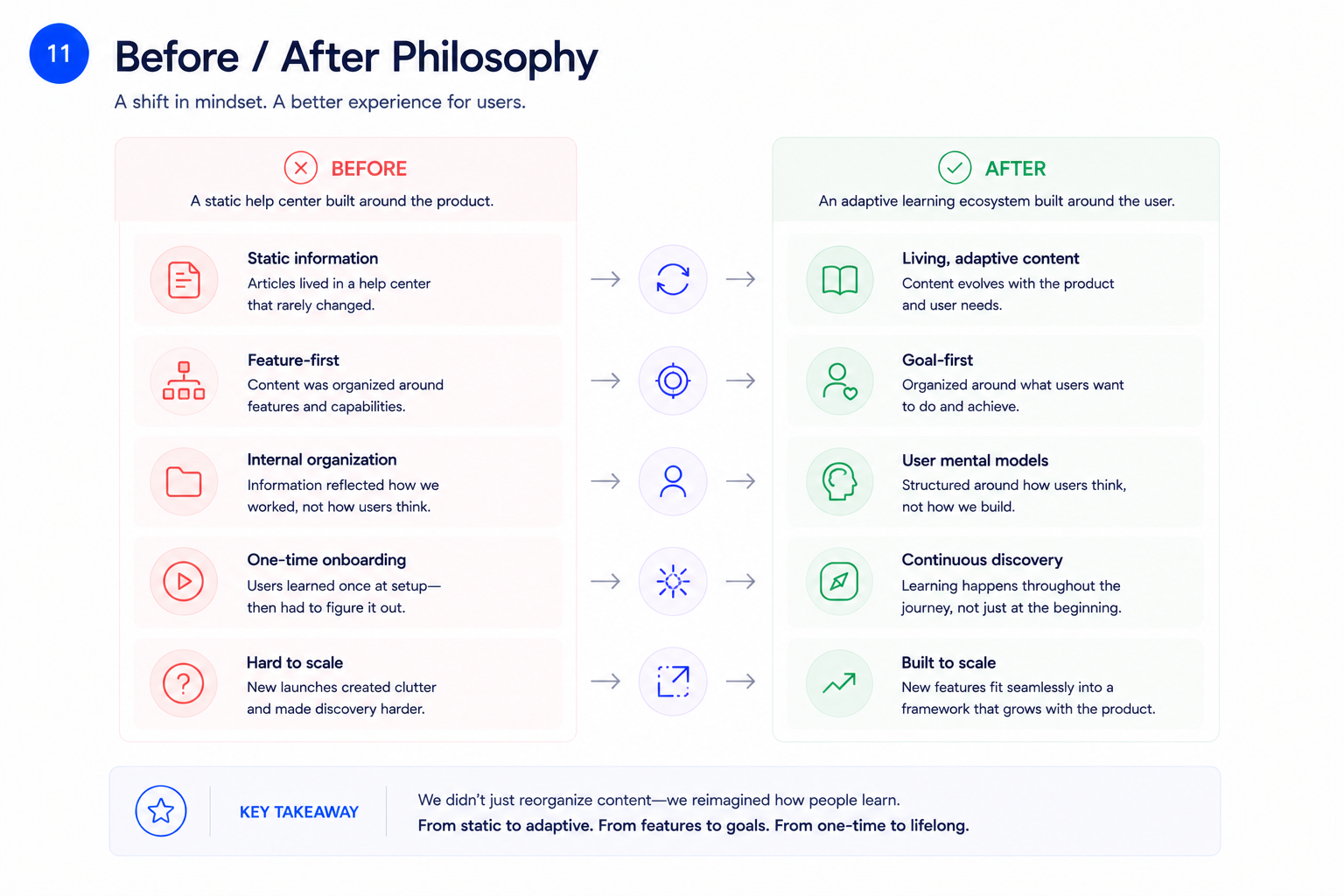
The existing education experience reflected the way the product was built—not the way people actually learned. Instead of supporting users over time, it functioned more like a static help center.
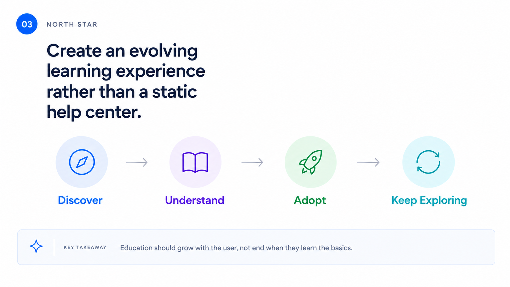
How might we create a learning experience that evolves with ownership rather than acting as a static help center?
My role
Responsibilities
Leading content strategy and information architecture
Partnering closely with Product Design, Product Management, User Research, Engineering, and Marketing to define the long-term vision for learning across the app.
Designing the content categorization model
Developing educational frameworks and navigation principles
Creating prototypes and research assets
Partnering on experimentation strategy
Aligning multiple feature teams around a shared content vision and production plan
The insight
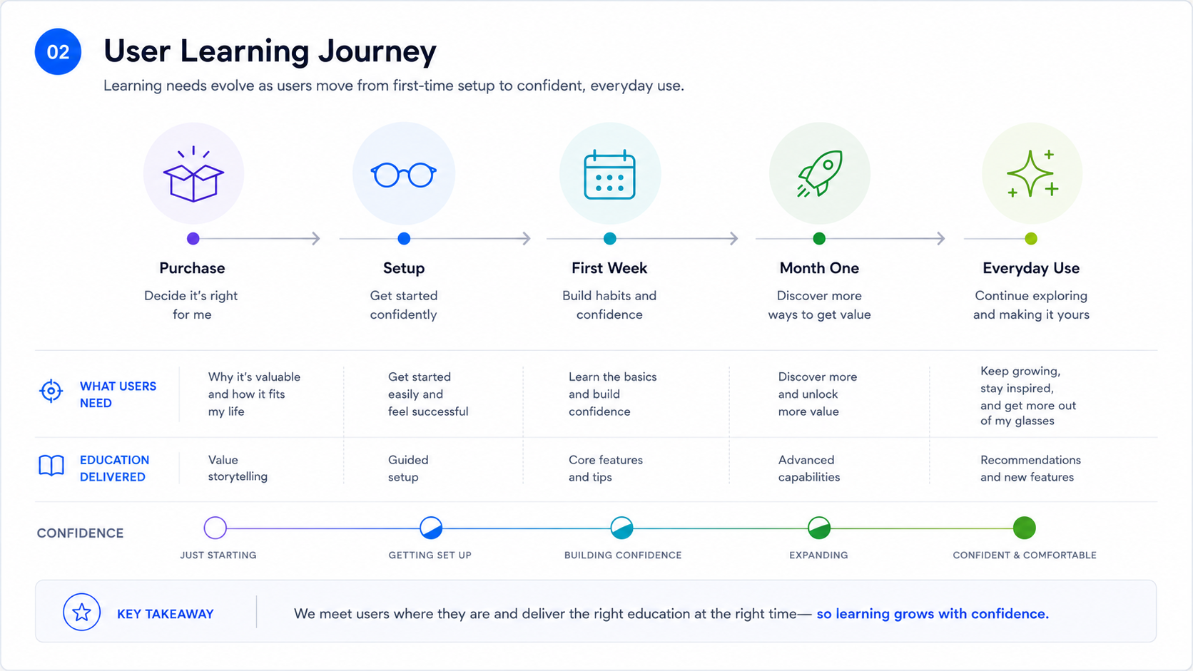
Research revealed that education wasn't a single event. It happened continuously throughout ownership.
People needed different kinds of guidance depending on where they were in their journey:
Getting started after setup
Discovering features they hadn't tried yet
Learning advanced capabilities over time
Returning to refresh knowledge months later
The existing experience treated every user the same. We needed a system that adapted to changing needs instead.
Strategy
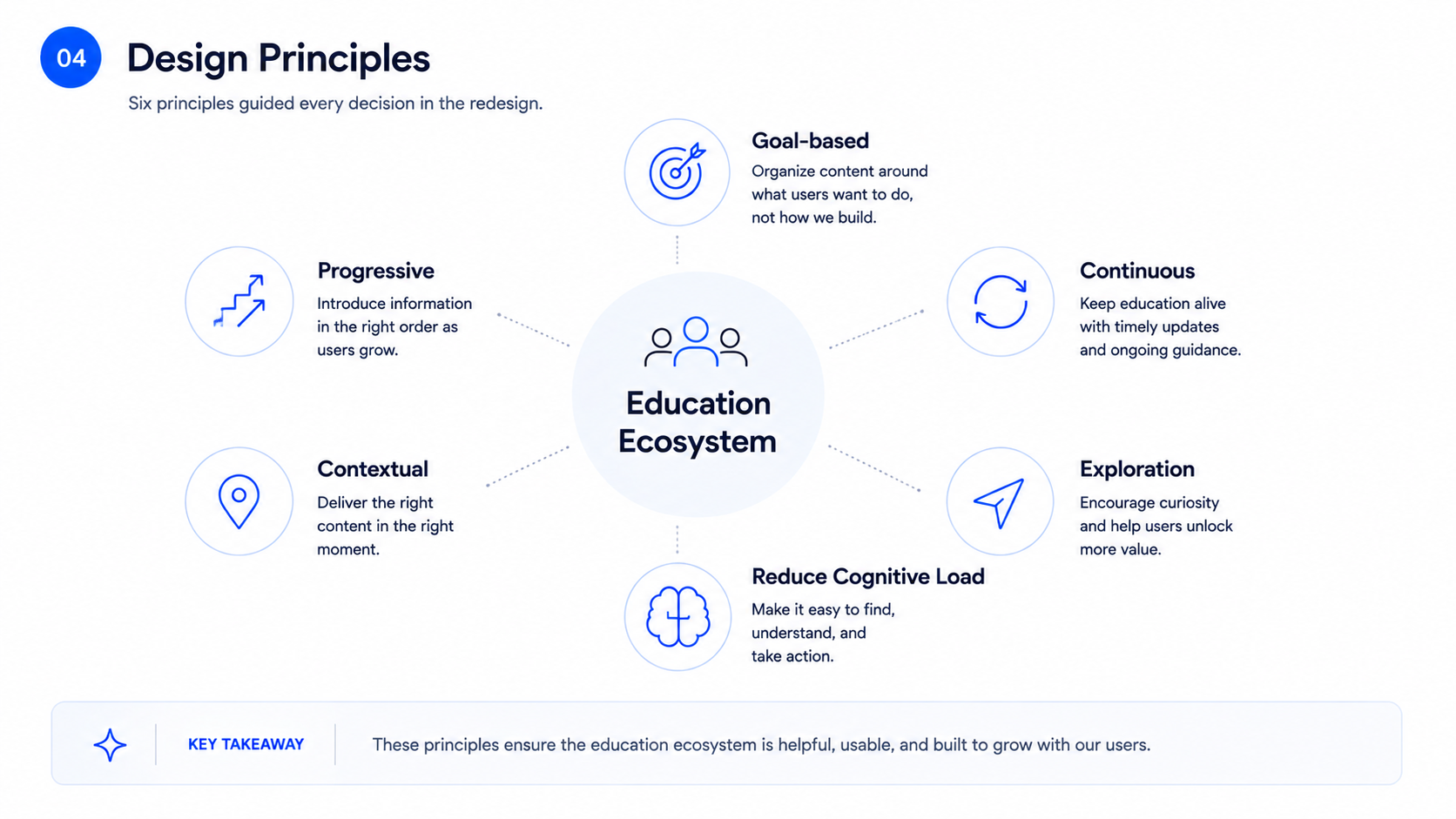
Rethinking the information architecture
One of the biggest opportunities was restructuring how educational content was organized.
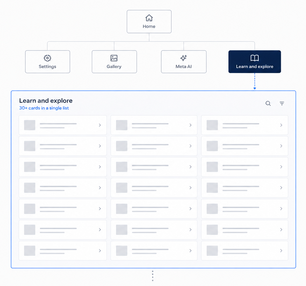
The previous experience relied on a relatively flat navigation model that became increasingly difficult to scale as new features launched.
Previous information architecture
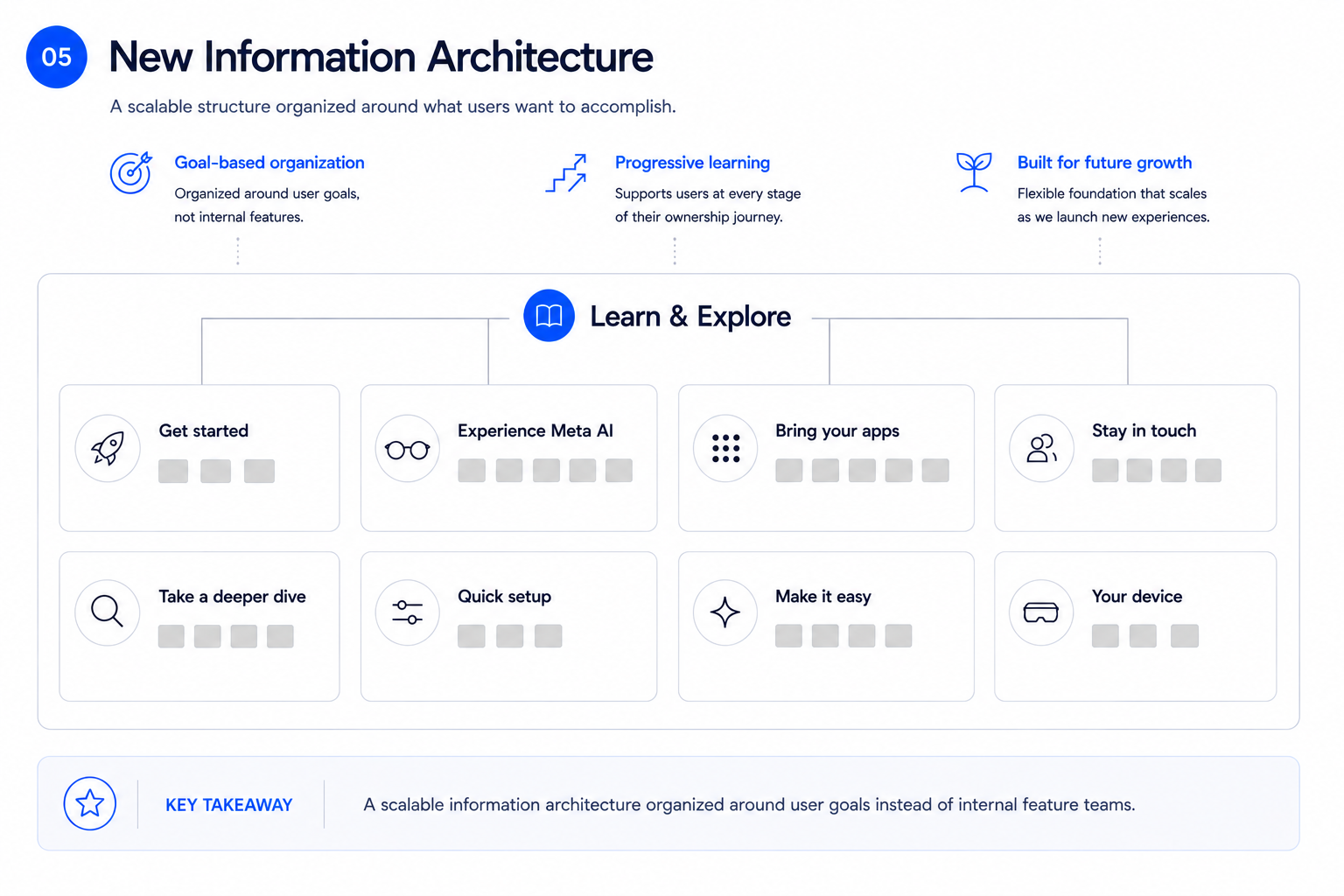
Building blocks
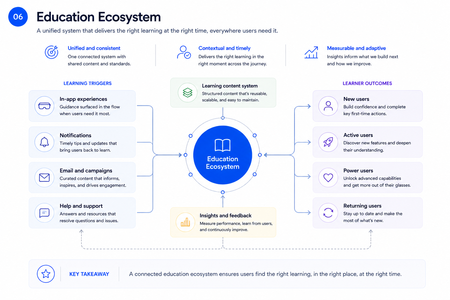
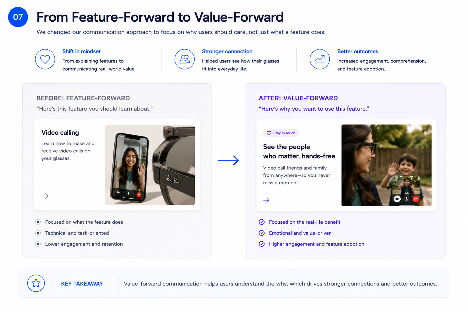
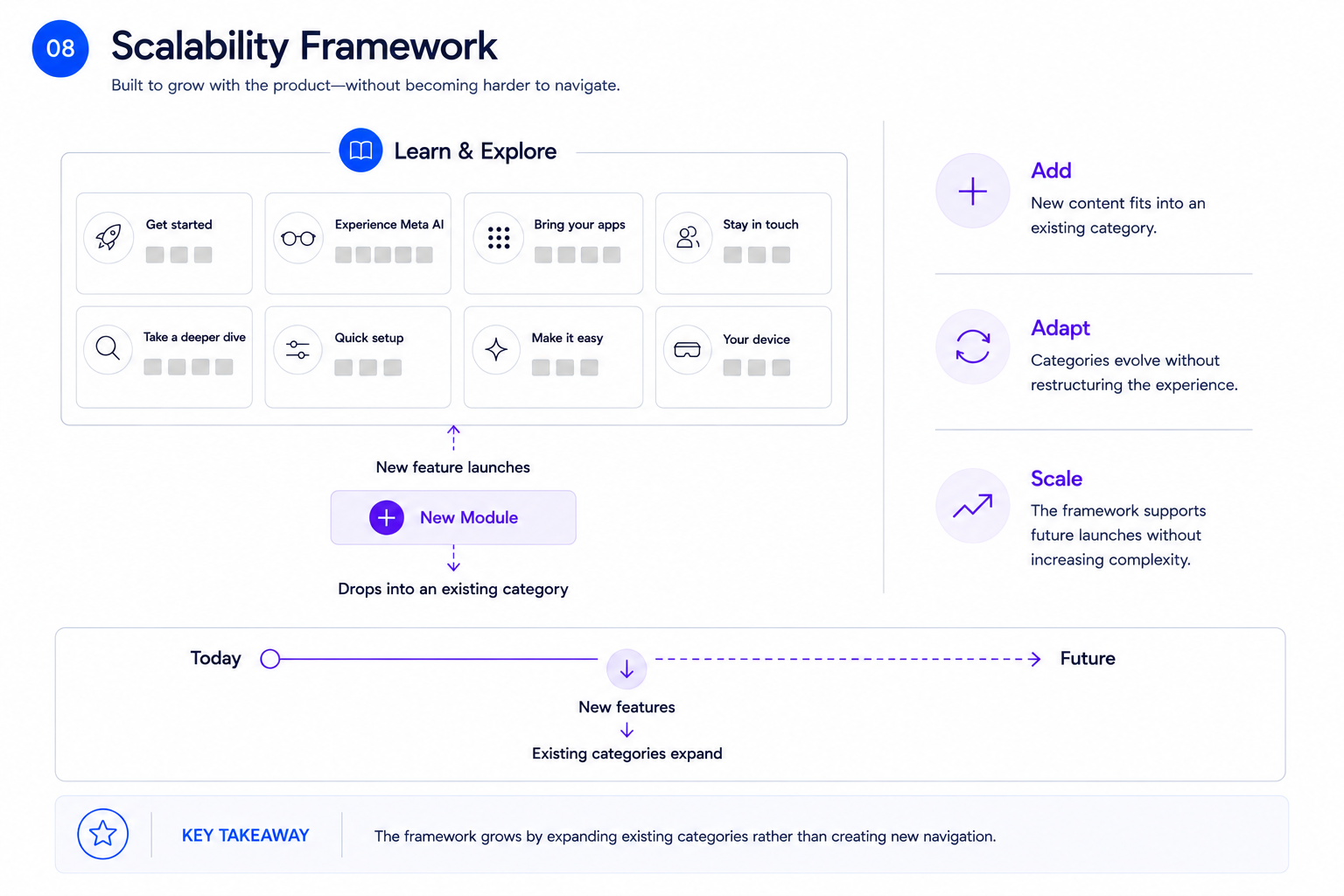
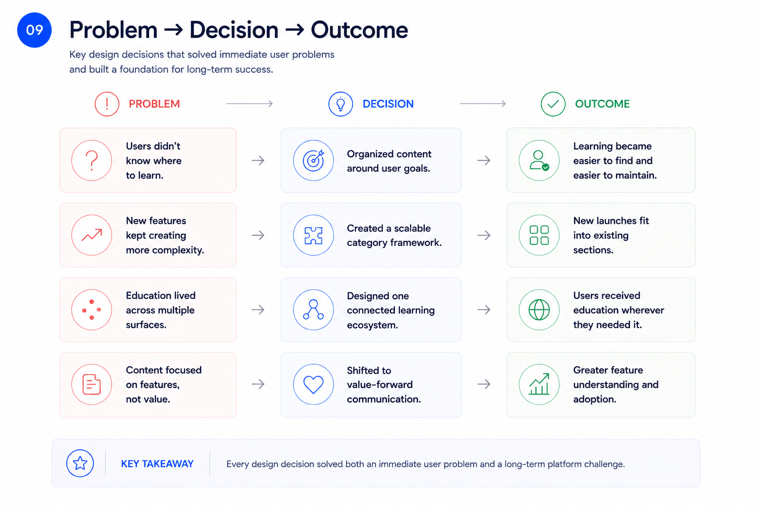
Outcomes
The redesigned education experience shipped as part of the Meta AI app and established a foundation that extended beyond the immediate release.
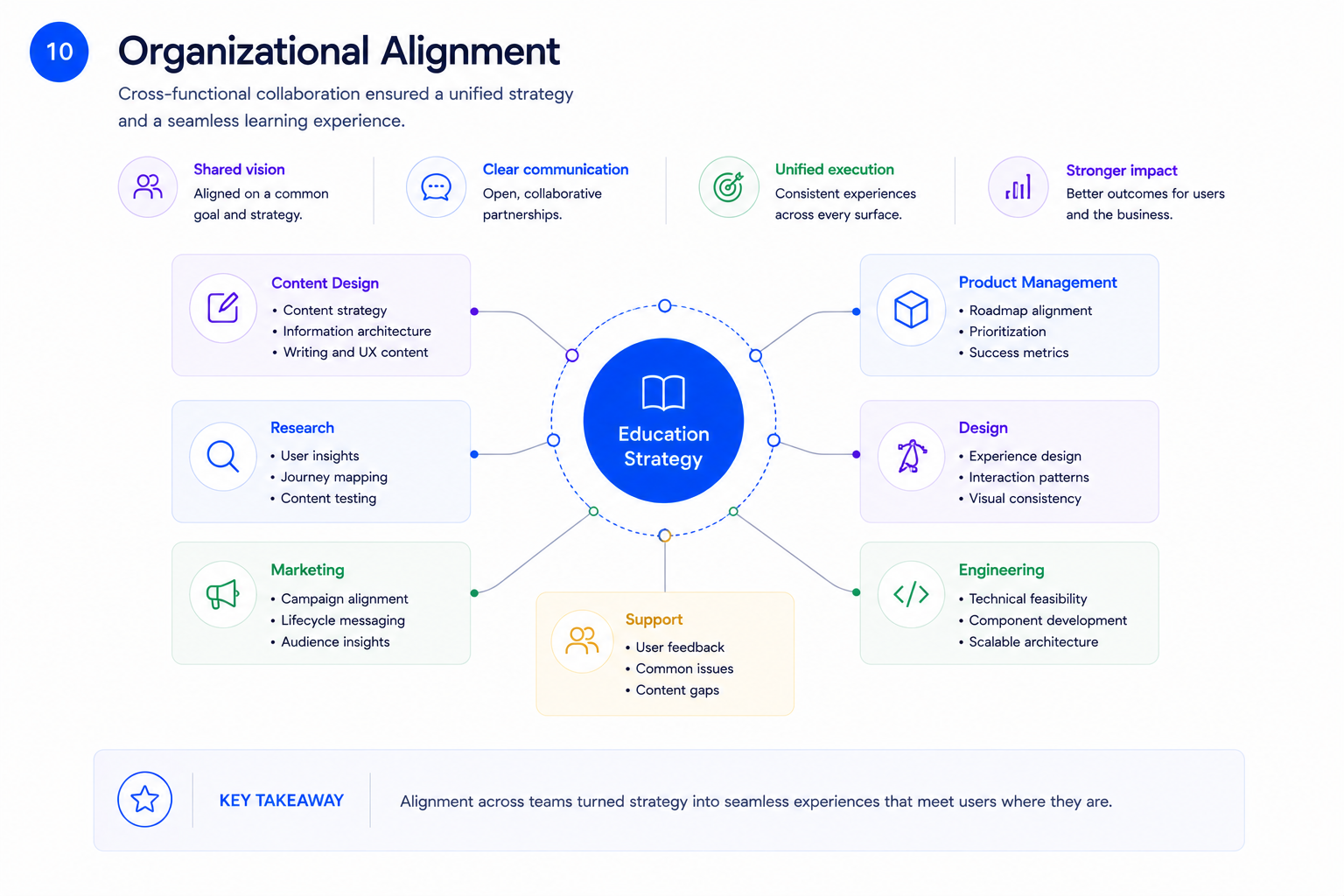
What I learned
Looking back, I'm proud that the work focused on changing the system rather than optimizing individual screens.
If I were approaching the project today, I'd explore even deeper personalization using behavioral signals to adapt recommendations over time, making the learning experience feel increasingly tailored to each person's journey.
One tradeoff we consciously accepted was balancing flexibility with simplicity. While there were opportunities to create highly customized pathways, we prioritized an architecture that teams across the organization could consistently maintain as the product rapidly evolved.
The biggest lesson was that successful education isn't primarily about better content. It's about designing an ecosystem that delivers the right guidance at the right moment.